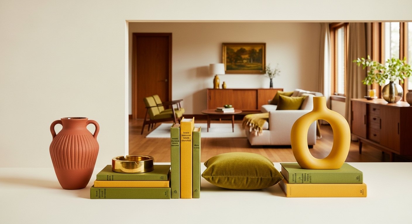
Terracotta, olive, and mustard are the colors that say mid-century, earthy, warm, optimistic, drawn straight from nature. Used well they give a room its soul; used heavily they tip it into a 1970s catalog. The whole art of a mid-century palette is restraint: a few saturated accents against a warm neutral base. Here's how to get it right.
Start With a Warm Neutral Base
The foundation of a mid-century palette is warm and quiet, cream, oat, warm white on the walls and large furniture, with walnut and teak wood tones anchoring the scheme. This warm neutral base is what lets the saturated colors pop without overwhelming. Get the base right and the accents almost take care of themselves. The minimal home edit is a good reminder of how much restraint the base wants.
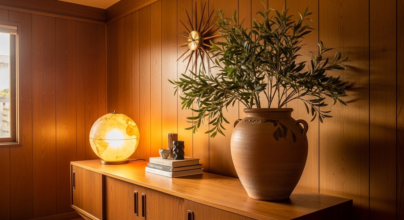
Terracotta: The Warm Anchor
Terracotta. That sun-baked clay orange, is the warmest, most grounding of the mid-century accents. It reads earthy and inviting, and it sits beautifully against walnut and cream. I use it in cushions, a runner, ceramics, and tile. It's the accent color I reach for first because it's so forgiving and so warm.
Olive: The Natural Green
Olive green brings the natural, organic note. It's a muted, earthy green that echoes the plants in the room and pairs effortlessly with terracotta. Both are warm, nature-drawn colors that belong together. A single olive armchair, a throw, or a vase of clippings in a wall vase brings the canyon's green inside.
Mustard: The Pop
Mustard, or ochre, is the joyful pop, a warm golden-yellow that lifts the whole palette. A little goes a long way: a mustard pillow, a ceramic, a piece of art. Against the terracotta and olive, mustard is the accent's accent, the touch of brightness that keeps the earthy palette from feeling heavy.
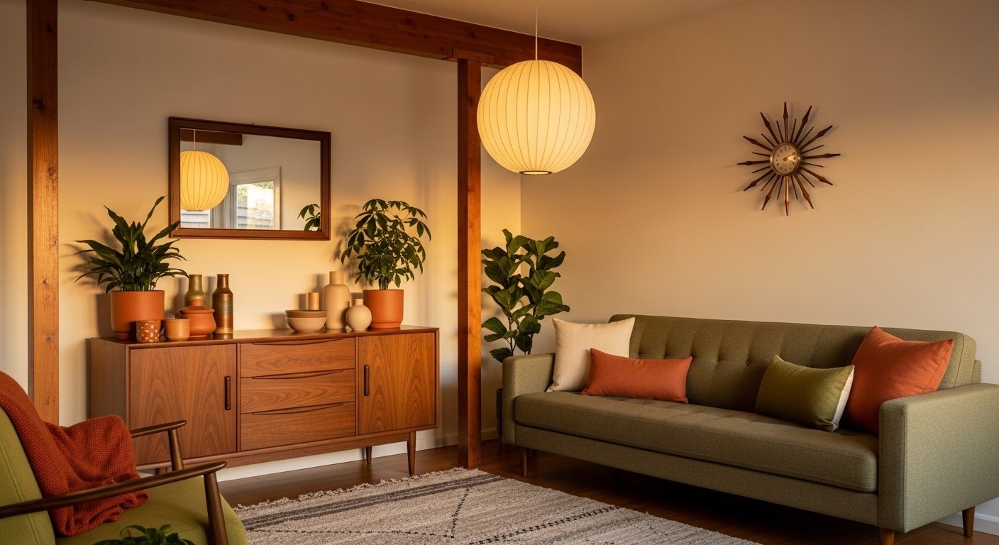
Accents, Not the Main Event
The cardinal rule: these colors are accents, never the whole room. Keep walls and big furniture in warm neutrals and walnut, then introduce terracotta, olive, and mustard through cushions, throws, ceramics, art, and small pieces you can easily swap. A few saturated touches against a warm base reads collected and timeless; saturating every surface reads like a costume.
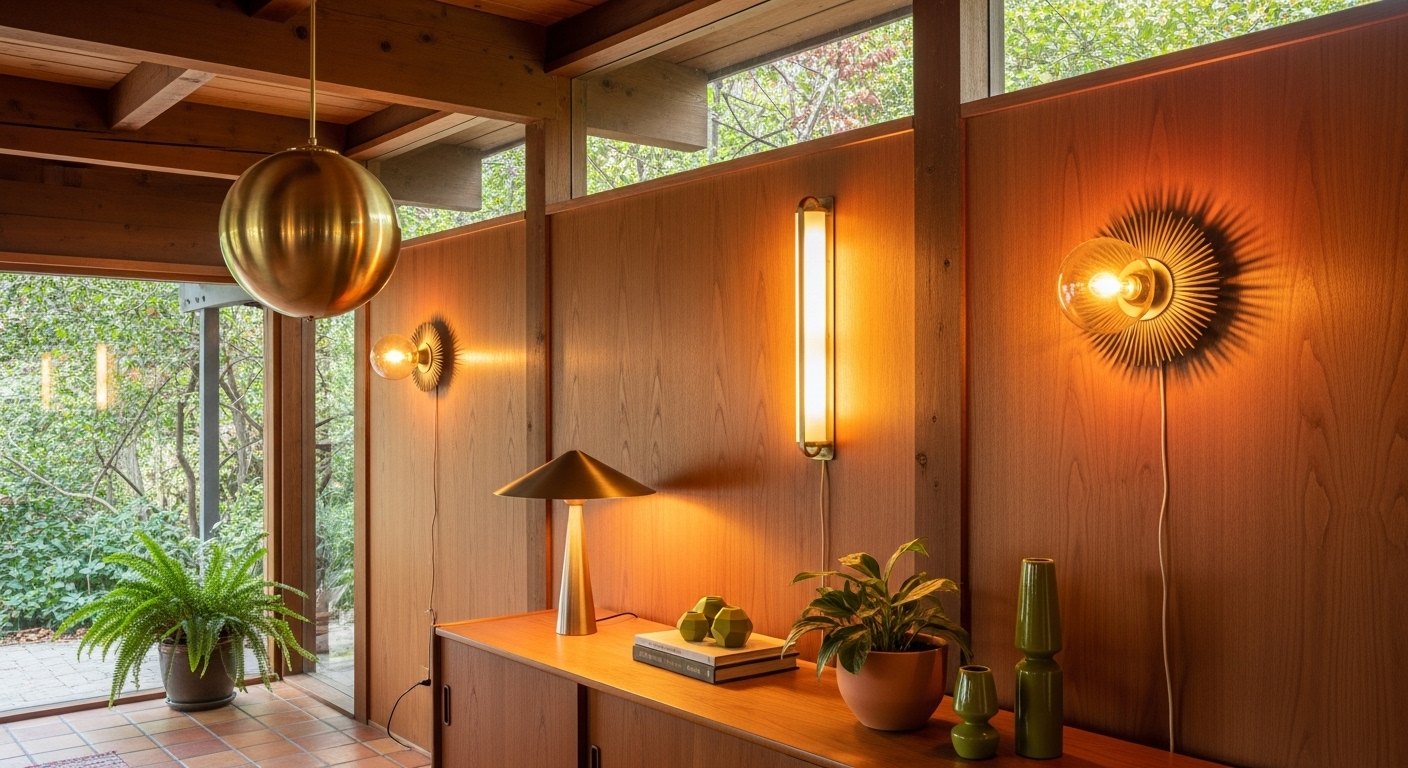
Let Warm Light Do the Work
These earthy colors come alive under warm 2700K light and go muddy under cool light. Warm light makes terracotta glow, olive deepen, and mustard turn golden. It's the difference between a rich, inviting palette and a flat, dated one. As with everything in a mid-century home, the warm light is what ties the whole scheme together.
Timeless, Not Trendy
Anchored in a warm neutral base and natural materials, used as changeable accents, and lit warmly, the terracotta-olive-mustard palette reads as timeless rather than dated. The earthy, nature-drawn colors have outlasted decades of trends because they're rooted in nature and used with restraint. Keep the base quiet and the accents few, and the palette stays classic.
Building the Palette
Lead with a warm neutral base, cream, oat, warm white. And walnut wood, then introduce terracotta, olive, and mustard as accents through cushions, throws, ceramics, and art. A few saturated touches against the warm base read collected; saturating every surface reads like a costume. The minimal home edit shows how much restraint the base wants.
Common Color Mistakes
People overdo it by painting whole rooms in saturated color, by mixing too many accents at once, or by lighting these earthy tones with cool bulbs that turn them muddy. Keep the bold colors as changeable accents, limit the palette, and light everything warm so the colors glow.
Keeping It Timeless
Anchored in a warm neutral base and natural materials, used as accents, and lit warmly, terracotta-olive-mustard reads timeless rather than dated. These nature-drawn colors have outlasted decades because they're rooted in nature and used with restraint. Keep the base quiet and the accents few, and the palette stays classic.
Shop this post: the minimal home edit and wall vases and pots